Released in beta in February, YouTube has formally rolled out its new One Channel redesign for all users. The redesign features a number of changes intended to optimize the YouTube experience across platforms/devices while providing creators with more opportunities to engage ‘ and grow ‘ their audience via exposure to more relevant content. Per YouTube’s Partners and Creators Blog, there are three core changes that you should be aware of which will help you get the most out of your new One Page channel design:
Design Channel Art to visually identify your brand
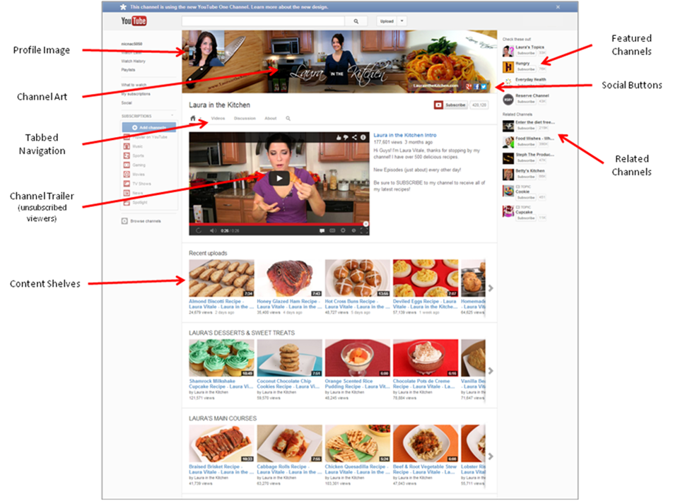
YouTube’s Channel Art (akin to Facebook’s Cover Photo) replaces the former ability to customize a background image. While some creative control is lost with this change, Channel Art allows for visual consistency across desktop, tablet, mobile, and TV displays. Additionally, social links that are added in the ‘About’? section will be automatically overlaid as social buttons on top of your selected Channel Art banner.
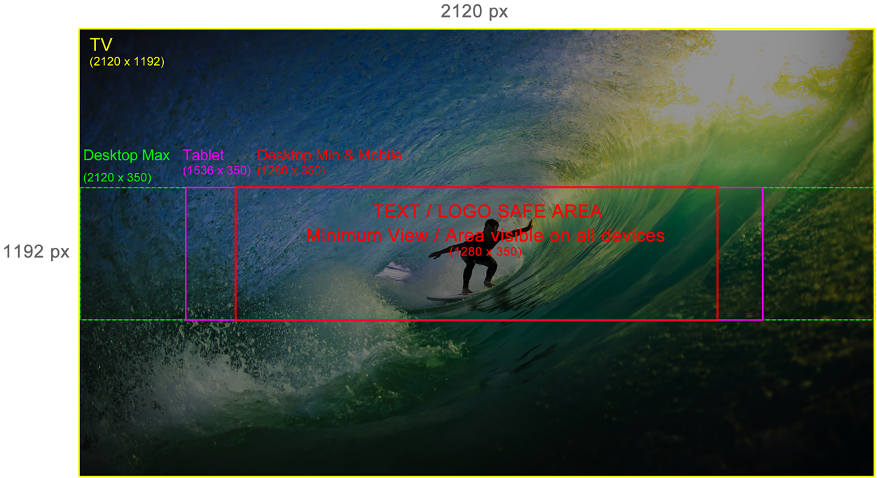
The new Channel Art feature ensures that your visual identity will automatically scale to any size screen (see pages 3 and 4 for dimensions), and that your social links will display on any device with a browser. Get creative with your Channel Art and show off your brand’s personality!
Create a Channel Trailer to encourage visitors to subscribe to your channel
The redesign provides additional utility for brands by allowing the ability to serve distinct Featured Video content based on whether or not the viewer is subscribed to your channel. The subscribed view is personalized for each user based on their unique viewing history while the unsubscribed view provides an opportunity to showcase a ‘Channel Trailer.’?
For subscribed users, this content is served as a ‘What to Watch Next’? recommendation with the default setting serving videos that a user has not yet viewed. For unsubscribed viewers, the Channel Trailer serves as an introduction to your channel. Google recommends keeping the content short ‘ think of it as an elevator pitch for your channel ‘ and having explicit calls-to-action to motivate viewers to subscribe.
Create custom Shelves to control how your videos and playlists are displayed
The ‘One Page’? redesign also allows brands the ability to customize how content is organized and displayed on your channel. Based on your content themes and insights into how your audience consumes your content, you can now choose from multiple layouts to best organize and highlight your content into customized shelves.
Shelves can feature collections of grouped videos or highlight favorite playlists ranging across owned and/or curated content. In-shelf navigation allows users to explore more of your content without leaving your channel homepage.
Sample One Page Layout: Laura in the Kitchen
For samples of the One Page design, visit the following channels:
- Laura in the Kitchen: http://www.youtube.com/user/LauraVitalesKitchen
- Intel: http://www.youtube.com/user/channelintel
- Vice: http://www.youtube.com/user/vice
- Real Madrid C.F.: http://www.youtube.com/user/realmadridcf
- The Pet Collective: http://www.youtube.com/user/ThePetCollective
How it works for Desktop:
- Total Size: 2120 X 350 px
- Safe Area (Always visible): 1280 X 350 px Centered on the image
- Flexible Area (maybe visible): 420 px to the left and 420 px to the right of the safe area

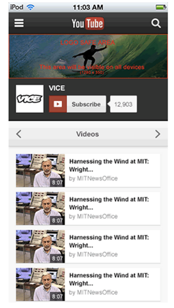
How it works on Mobile
On mobile, YouTube will be using the safe area (red box in diagram above) scaled down to the width of the mobile screen (which varies by device).
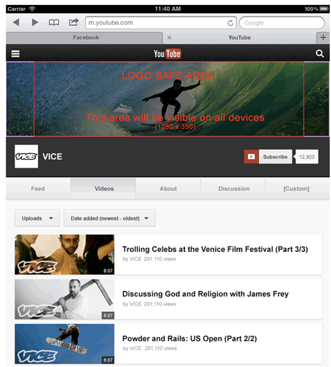
How it works on Tablets
On tablets YouTube will be using a slightly wider slice which is indicated by the pink box above. The aspect ratio of this slice is 1536 px by 350 px.
