Losing our noodles over the new Maruchan.com
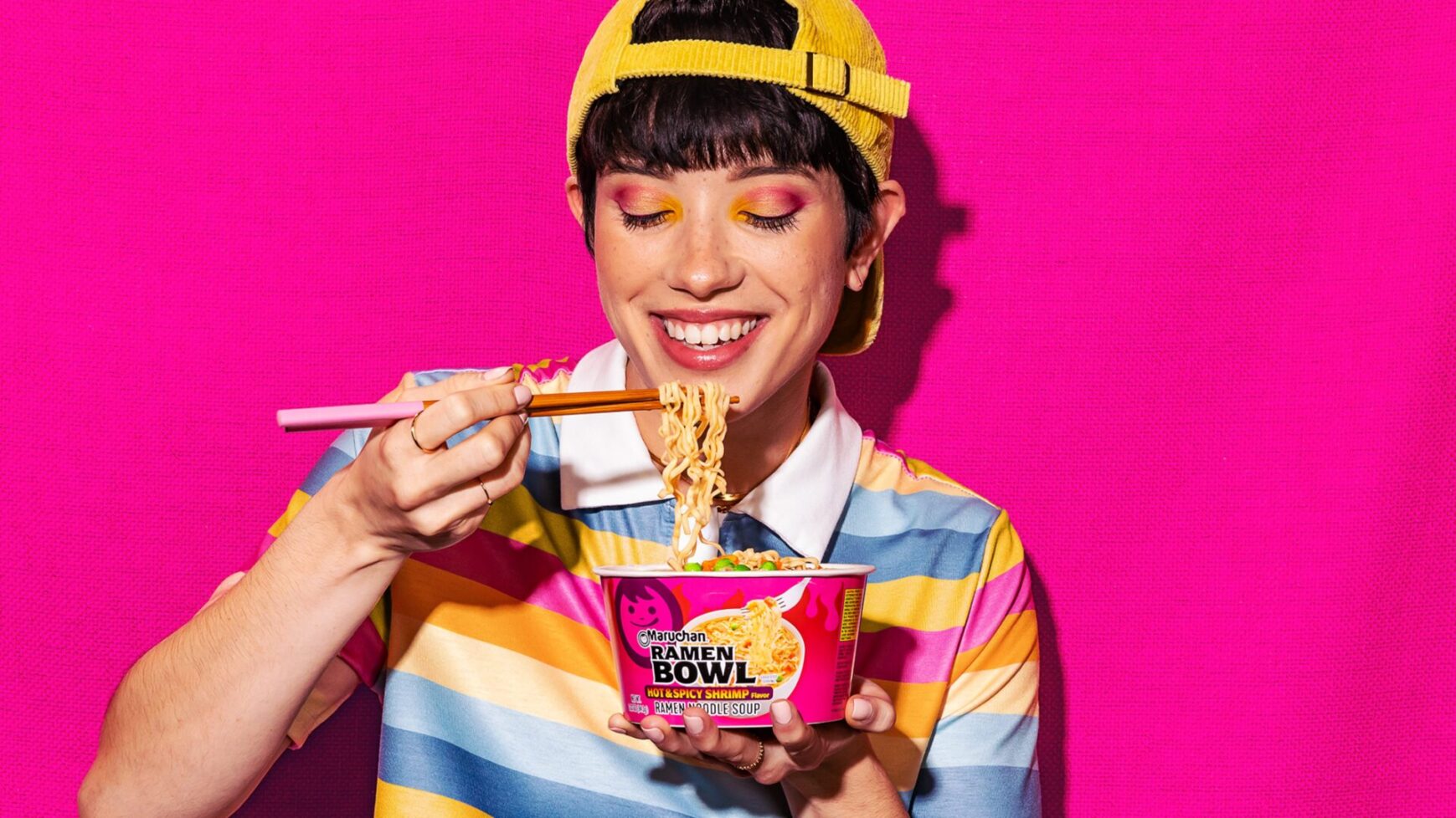
A website as bold as its flavors.
Since 2017, we’ve been the proud agency of record for Maruchan. As their trusted partner, we undertook a comprehensive review of their digital ecosystem, proposing a website revamp as part of this strategic initiative. Our challenge was to reimagine and rebuild their site from scratch using WordPress to authentically reflect their bold, vibrant, and playful brand identity.

Website Redesign, Best in Show 2024
Davey Awards

General-Food & Beverage, Gold 2024
Davey Awards
Our Strategy
Embracing the bold
During stakeholder meetings, it became clear that the brand’s emphasis on color was paramount. Our challenge was to design a website that maintained a cohesive master brand identity while also distinguishing each product line as its own integrated sub-brand. Our mission was to “find unity amidst diversity.”
We approached this task by embracing the unique characteristics of each product line, from packaging to product features. By identifying common themes and patterns, we established the groundwork for a flexible design system that could adapt to each product while maintaining structural integrity.
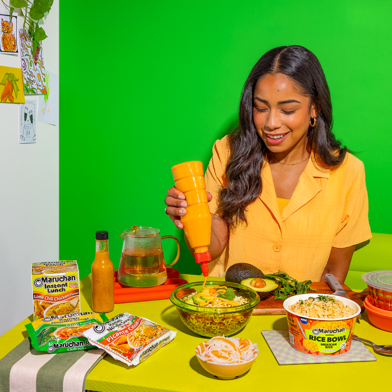
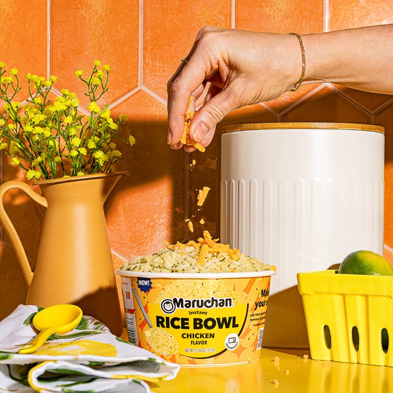
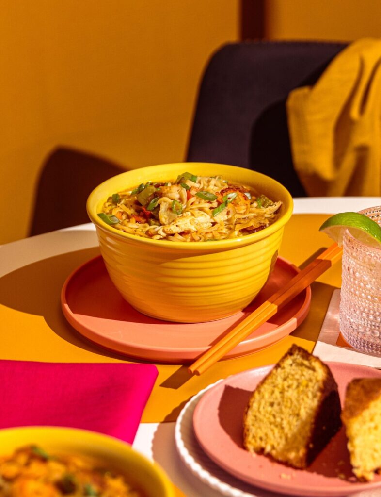
Focusing on bringing the products to life, we conducted an extensive photoshoot, capturing new lifestyle and product imagery to present the final products in their most authentic form.
A system that excites
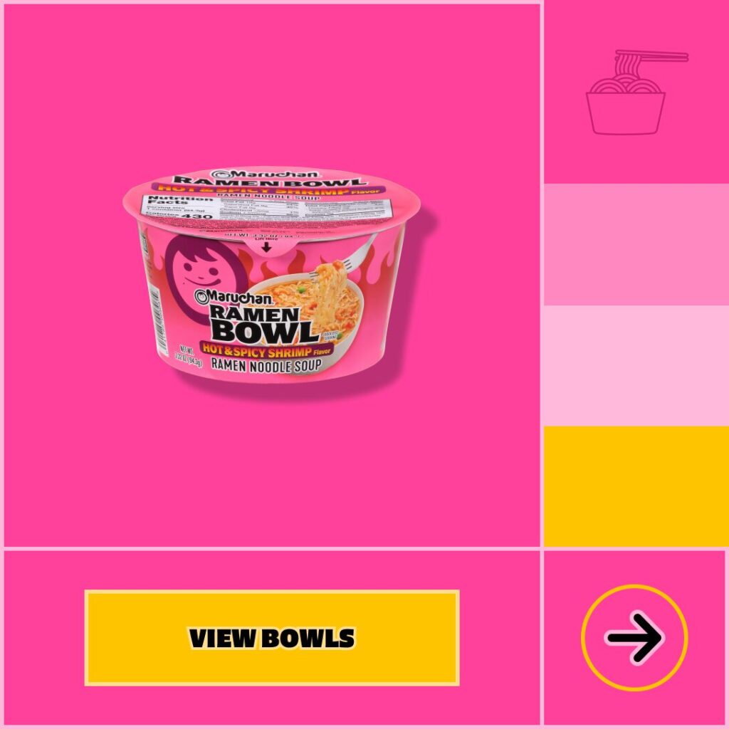
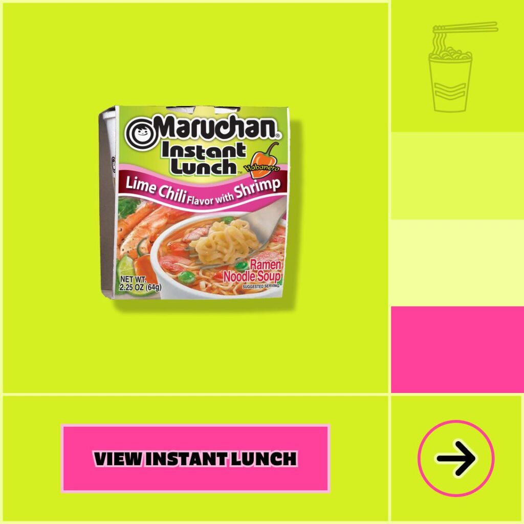
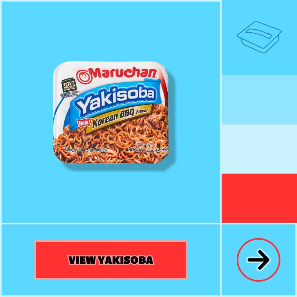
We aimed to organize the vibrant packaging designs while preserving their boldness. By categorizing the seven core product types, we devised a tailored color scheme that corresponded with each product type, creating a versatile system capable of accommodating future products.
Moments that delight
Maruchan’s logo has a smile for a reason; our goal was to utilize this playful nature to bring joyful moments to unexpected places. By injecting elements of fun into micro-interactions, users are encouraged to play more and explore the site deeper. Puns, pop-culture, retro references and vibrant imagery all help serve healthy doses of playfulness.
Product Pages
Find your pack
We simplified the navigation to better categorize products, ensuring users are fully immersed in each product’s unique personality. As part of this, we ensured users can easily search for their favorite products without interrupting their browsing experience.
On individual product pages, we showcase the product in its packaging, allowing users to easily identify it. Through scrolling, users can transition to seeing the prepared product, providing a comprehensive view from shelf to plate. Additionally, once users find their desired product online, we made it equally easy to locate in-store, offering various pack sizes from units to full cases at both retailers and e-tailers to cater to their needs.
Design System
Product packaging can’t break this system
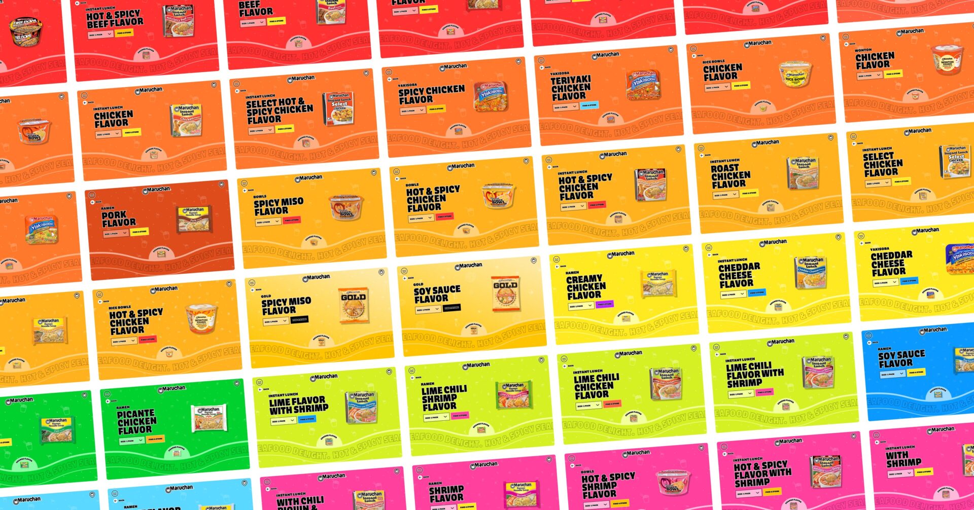
We revamped and simplified the navigation, enabling better organization of product categories. However, it was the design system that truly unified the visual language of each category, lending cohesion to packaging that stood out even within its own sub-brand. From the packaging to the patterns and backgrounds, users encounter consistency within each category, facilitating comprehension of products with shared attributes in design and organization.
We embraced the bold, vibrant colors of the packaging while also establishing some structure for the overall lineup. A custom color system was implemented to align with each flavor, ensuring a flexible approach that can accommodate future product additions seamlessly.
Recipes
A crave-worthy recipe experience
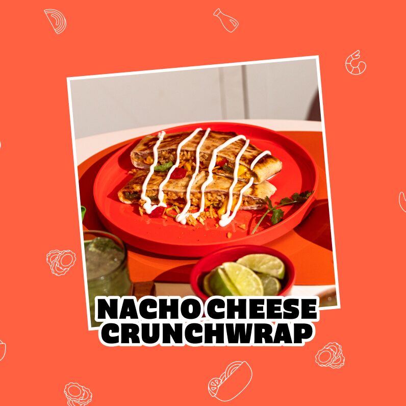
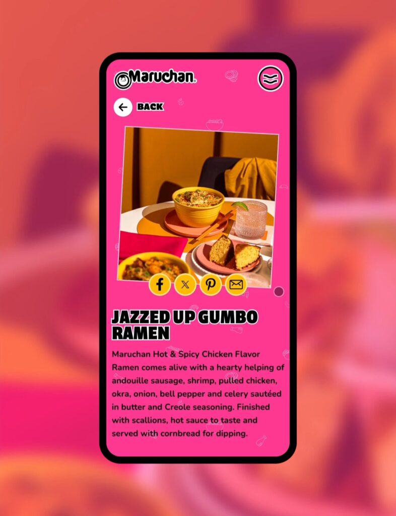
The recipe section was given a total overhaul. Uniform layouts were simplified to bring the product imagery to the forefront, courtesy of a swoon-worthy photoshoot featuring bold, vibrant colors and mouth-watering dishes.
The updated recipe layout and a simpler mobile experience with step-by-step photos for users to follow along caters to a more practical experience, and one strategically optimized for mobile, the go-to screen in your kitchen.
BRAND
Cohesiveness from site to social
It takes a clear vision to create a cohesive brand style, and all the unique elements serve as a critical sum of its parts. From photoshoots to micro-interactions, ramen culture, mouthwatering plates, and bold patterns, each piece serves to bring the Maruchan brand to life anywhere in its digital ecosystem.
The results are in and the new site not only looks amazing but is performing amazingly well.
+37%
Average Engagement Time on Site has increased
+46%
Number of Engaged Sessions per User has increased
+48%
Product pages saw an increase in organic search traffic
27
Non-brand ramen keywords increased to a top 10 position in Google search results
