Designing a flexible and targeted new site for developers
Redesigning the experience for developers
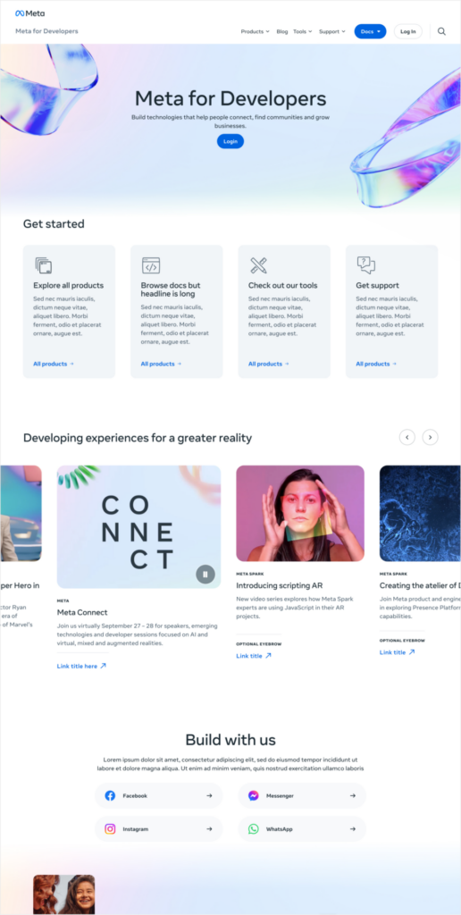
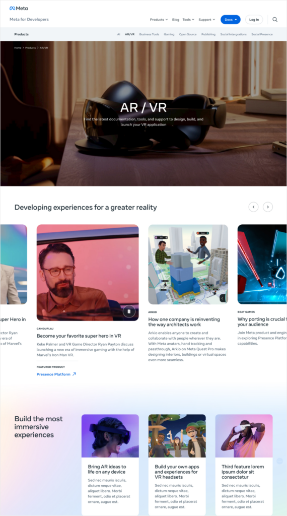
The Meta for Developers website is the primary destination for developers looking to leverage and integrate with Meta’s platforms, products, services and SDKs. It caters to developers of all levels, from beginners to professionals, and represents a broad range a broad range of interest including (but not limited to) a broad range of interest including (but not limited to): AI/ML, AR/VR/MR, open source enthusiasts & developers, desktop/mobile developers looking to implement our Family of Apps APIs, SDKs, platforms and products into their applications.
The vast website maintains over 10 million monthly visitors, it’s a massive global community.
Challenge
The forgotten thread
Meta is responsible for some of the largest contributions to the development profession in recent years. As an industry leader they naturally want the developer site experience to mirror the quality of service their development tools offer.
When we kicked this project off, the top of funnel site struggled to guide users to appropriate documentation and forums. Some user journeys even required clicking on the same information multiple times to get to a desired page. Navigation was unclear and content was organized differently on different parts of the site.
While information architecture is enough of a challenge, Meta had made some exciting new changes to their brand this was the first project to activate the new branding. We were excited to bring this brand forward in the new site.
Insights
Taking a holistic approach
To address these challenges, Amp took a holistic approach starting at the base level. Initiating our own qualitative audience research we dug deep into the developer audience. Who specifically is this website for and how are they finding content now? Does skill level at all change behavior?
In addition to the audience, it’s crucial that the site scale for the 50 (and growing) developer products Meta offers. This presents not only an information architecture challenge but one of design systems as well. How can this site be more readily maintained in terms of content and production?
Qualitative Research
We ran a qualitative research study consisting of 32 participants from all over the developer spectrum ensuring a mix of specialities and skill levels. 45 minute interviews were conducted with these individuals where we gained insights into their processes, goals and pain points.
As the interviews were conducted we started to see patterns emerge around the site’s information architecture, brand and search functionality. We also noticed a significant desire for social proof and social interaction in the developer forums.
Audience
The Amp UX team synthesized our qualitative research with what the Meta team already knew to create robust user personas and cross referenced it with the current site. This process defined a set of clear entry points and goals for developers of all levels whether they be hobbyist or tenured professional.
We prioritized our personas to define the key target audiences, analyzing each do define goals and pain points. User journeys naturally flowed from this process and brought well informed updates to the site’s information architecture.
Solution
Revamped and reloaded
With insights in hand Amp iterated through a complete redesign. Everything from high level architecture down to the minutiae of fading gradients was considered. The result is a truly functional site that’s as beautiful as it is useful.
A new architecture
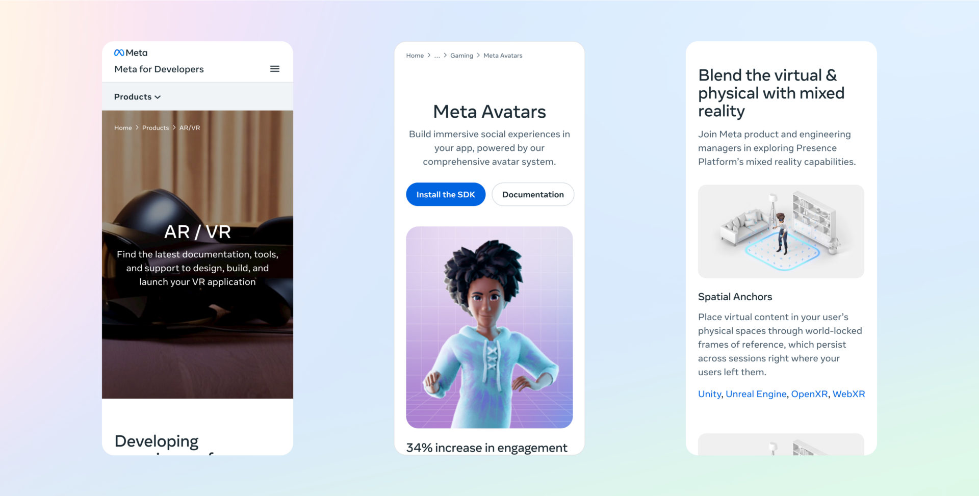
The Meta for Developers site had grown past the bounds of its previous information architecture. The result was an unwieldy grid of products. To counter this a new sub-navigation was introduced that intuitively guides users to product categories, allowing for fluid exploration. In addition to new category pages a robust search and filter system was introduced further aiding users in their search for specific product solutions.
The Meta for Developers team genuinely seeks to help developers in their journey. So keeping developers informed and inspired to produce the worlds best software was a key goal. Fully integrated into the site architecture and page layouts were more opportunities to highlight success stories and recent news.
Content agnostic modules
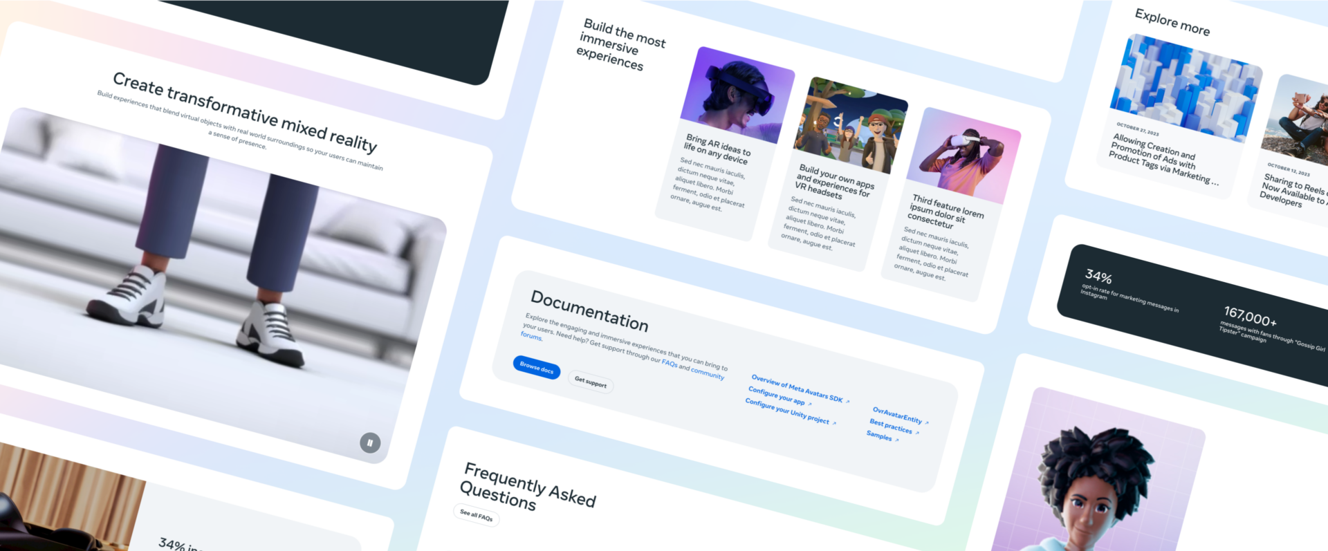
The Meta for Developers site is huge. With over 50 product landing pages, blogs, and success stories there’s a lot of content to manage. For such a sizable site it’s crucial to have a design system that’s robust enough to truly convey brand and flexible enough to support any content.
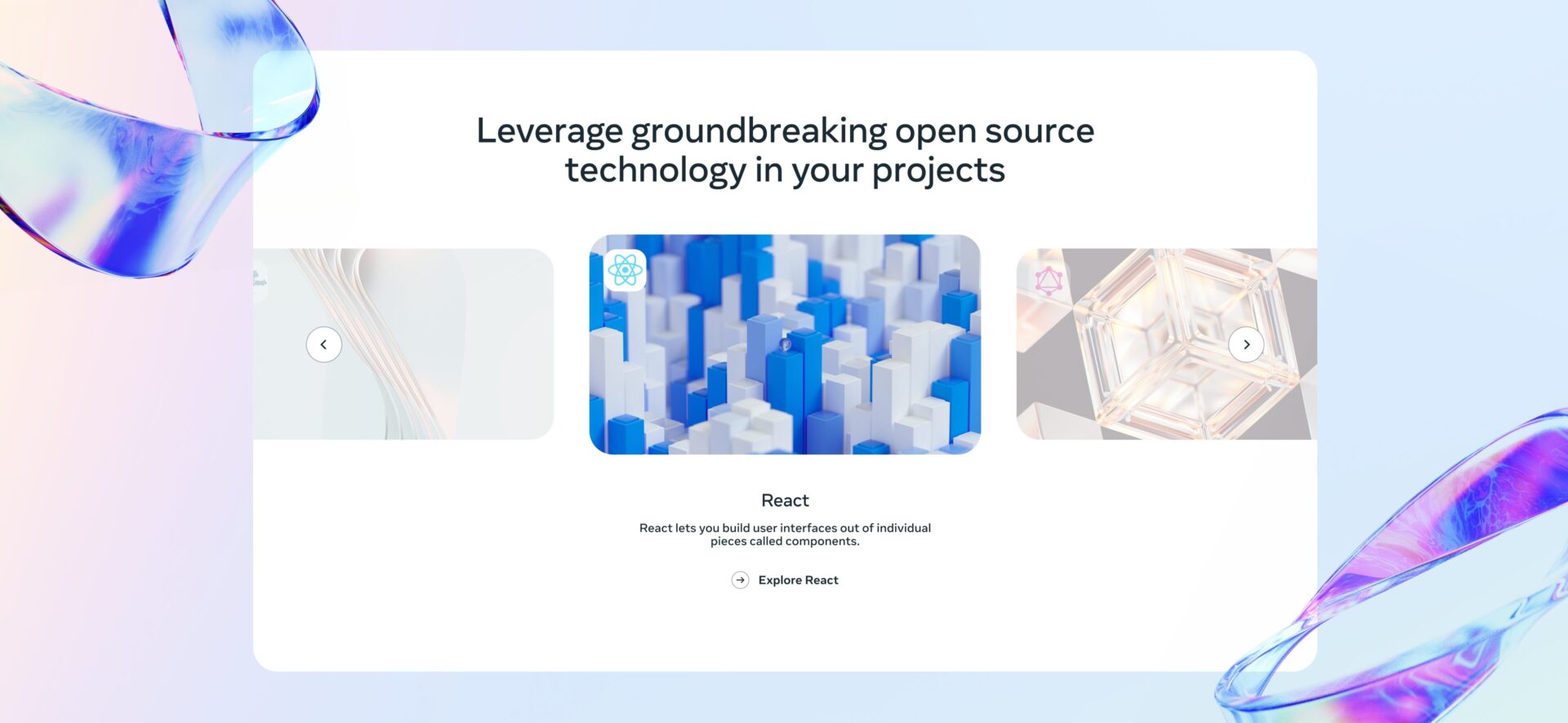
So, starting with the Meta brand system, Amp designed an entirely modular website. To allow for the huge range of content we created 28 flexible new modules and 3 components… At first this sounds small but these modules allow for well over 500 possible permutations and all fit together seamlessly. This means any page can be constructed via CMS with little (if any) design or development support.
The tldr;
Amp completely reimagined the Meta for Developers site. Leaning on audience learnings, insights and business goals a strategic new site architecture was created. By further refining navigation structure and search functionality the new site is intuitive and easily leads users down the product funnels.
Alongside structural improvements the site was visually brought up to Meta’s brand standards. These visual improvements were established in an extremely flexible design system that allow content owners to quickly create functional and beautiful web pages.
Find out how we can put solutions like these to work for you.


